The Problem
UCLA students struggle with subleasing, using platforms that weren't built for it.
Entering my third year, I needed summer housing for my first time outside a dorm. 2 weeks of Reddit threads, Facebook groups, and texting friends-of-friends, I found something. I got lucky and I knew it. I asked friends if they found a place, and kept hearing the same story with different details.

left to right — Facebook, ULoop, Reddit
No standardized apartment info. Posts are inconsistent in pricing, dates, room details, forcing constant back-and-forth just to get basics.
Platform switching is common. Students juggle Facebook groups, Reddit threads, Instagram stories, and word of mouth with little reliability.
Trust is always a concern. Communicating across informal channels with no verification adds anxiety to a process of high importance.
Research Insights
We surveyed 60 UCLA students across all years and living situations, then conducted 8 interviews with seekers and renters.
My subleasing story turned out to be less unique than I thought, deja vu from conversations with friends scrambling to find a last-minute spot.
75%
rated the subleasing process as highly stressful, even students who hadn't done it yet
83%
said trust and clear listing information were their top priorities
70%
reached out to listings on at least 3 different platforms before securing a sublease.
Seekers lacked confidence in listings, going through multiple points of entry. Listers had no idea why people weren't responding.
Process
With under 5 weeks to build, I owned design and prototyping end-to-end.
With limited capacity for user testing, I prioritized iteration and feedback rounds. Tight constraints shaped my flexible workflow.
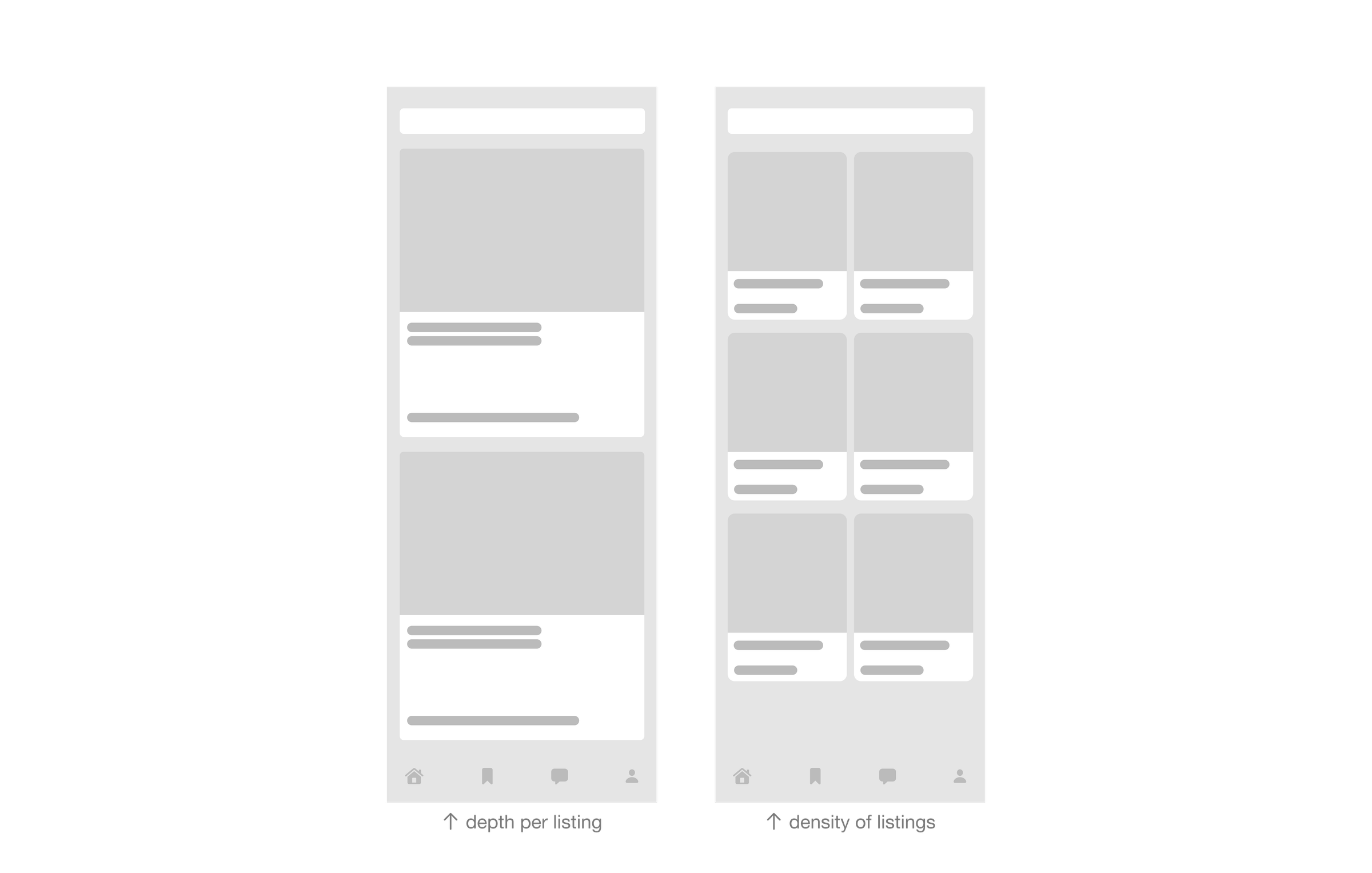
Early layout exploration in Figma
Figma
Wireframes, user flows, and component structure to establish hierarchy.
Google Stitch
Explored alternate information architectures to see what held up before moving into detail.
Claude Code
Built interactions and prototyped in real time, allowing for iteration. I was able to focus on creating a feeling.
Vercel
Deployment and testing on a more native iOS view.
Design Decision
Condensing apartment info into a standardized format.
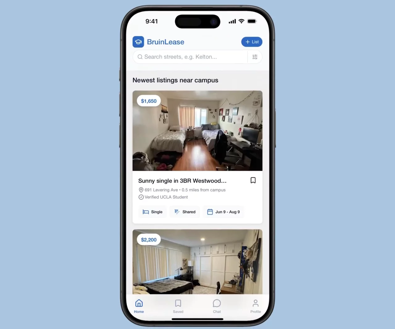
Based on research insights, I explored card layouts to communicate apartment details without being overwhelming. This is the first interaction with hundreds of listings, so conveying essential info without additional fluff is important.
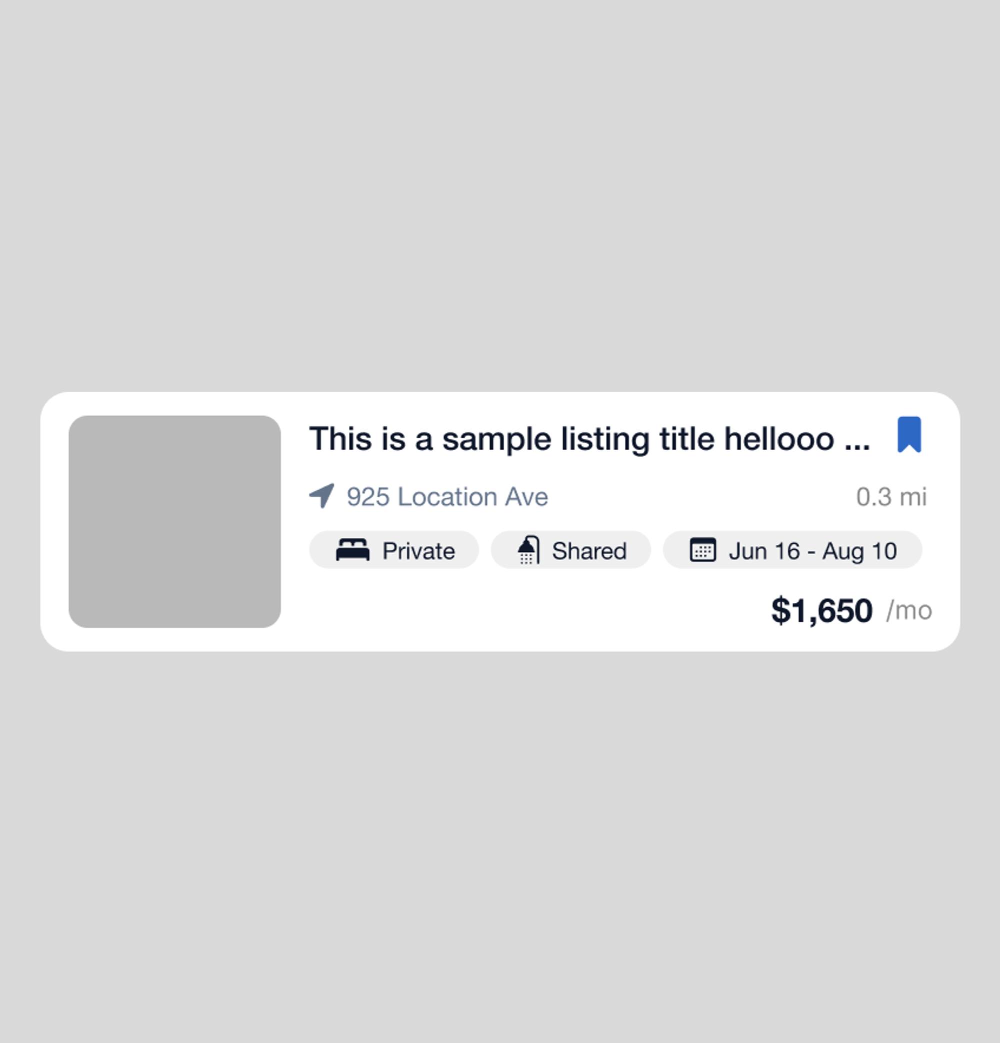
condensed
Compact format for fast-scanning
Thumbnail too small for preview
More listings, less intentional scan
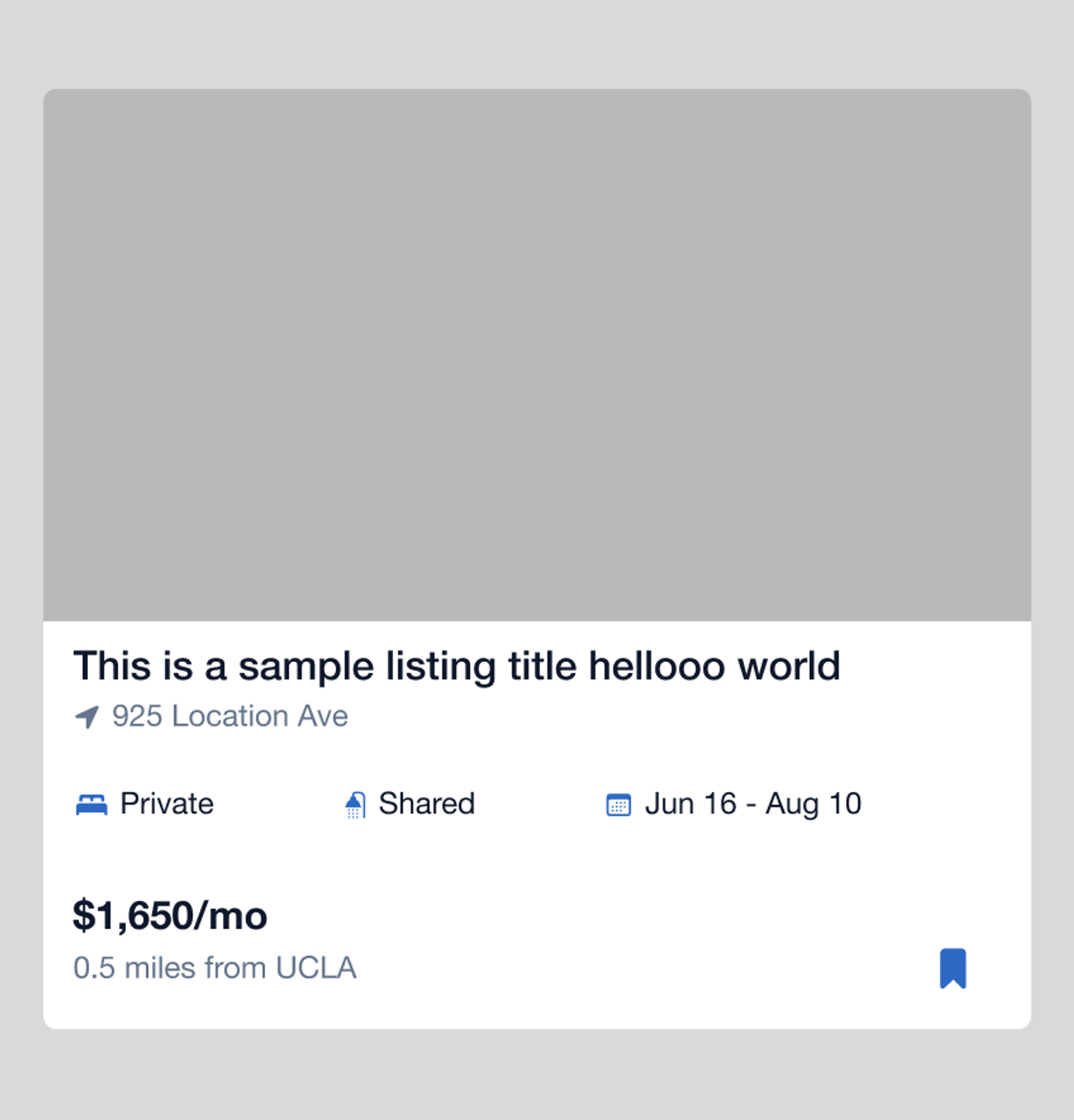
expanded
Larger card provides hierarchy
More listings, less intentional scan
Preview image visible + carousel
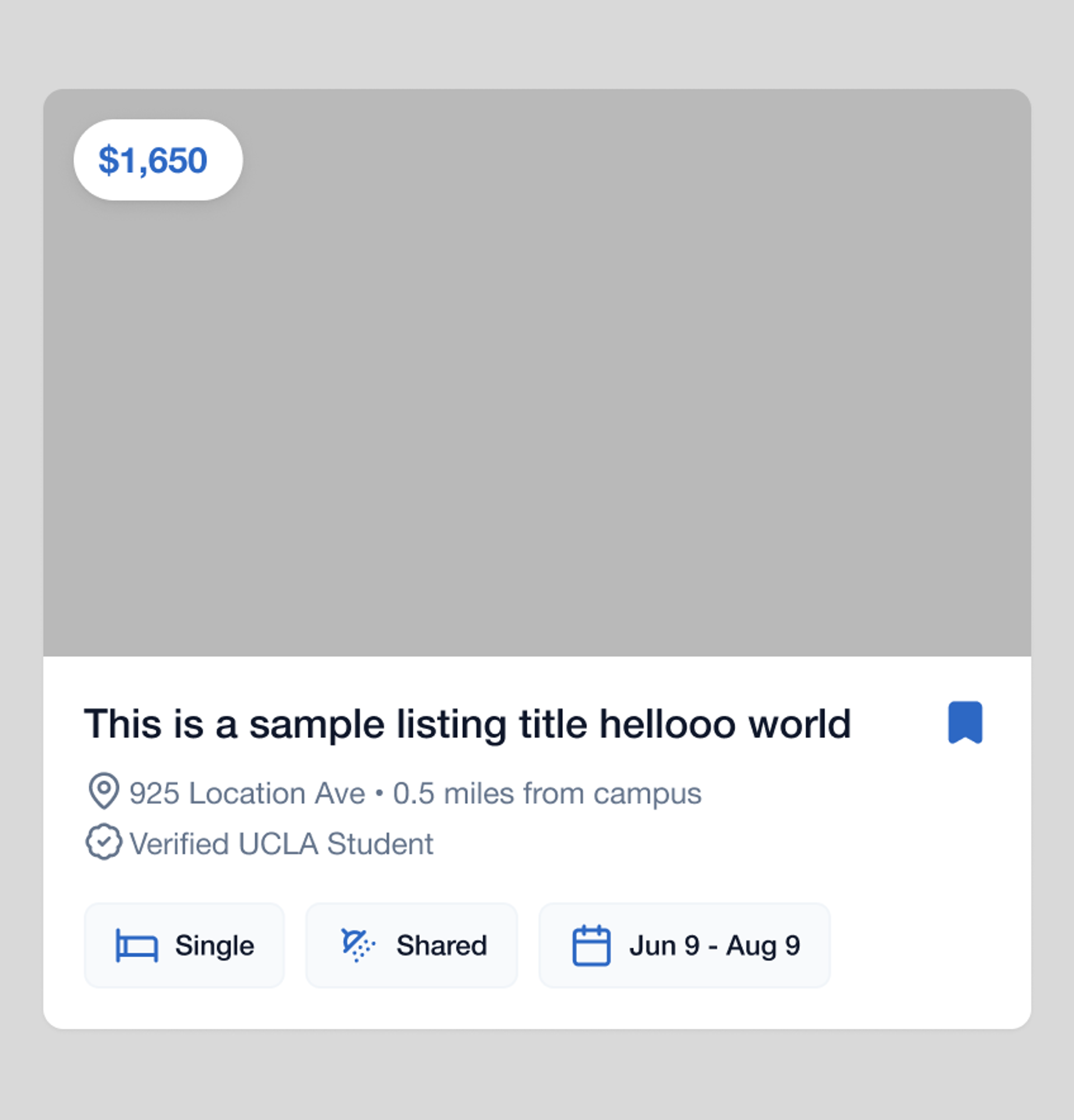
final - improved hierarchy
Refined hierarchy with price separate
Location on one line
Verified student indicator
research insights drove key changes
83% valued trust as their top priority → verified student badge on listings and messages, tied to edu email
price moved to top left pill, first things eyes notice when scrolling
students think in distance, not addresses → showing both together is intuitive
Design Decision
Reviews are sifted and displayed by default.
I added an independent layer with aggregated reviews, auto sifted on every listing to provide quick access to otherwise external information. Seekers are able to see real reviews without navigating lengthy forums.
Design Decision
The academic calendar is built-in.
Subleasing demand follows UCLA's academic calendar, not arbitrary calendar windows. One tap eliminates an initial barrier by filtering date ranges that work for you.
Selecting a quarter autofills exact move-in and move-out dates.
Design Decision
In-app messaging keeps everything in one place.
Students were context-switching between Instagram DMs, texts, and email threads to coordinate a single sublease. Bringing messaging into the platform closes the loop and makes the lister–leaser handoff traceable.
before
after
Solution
BruinLease is a dedicated subleasing platform built specifically for UCLA students.
Digestible listings, quarter-based search, verified identities, and in-app messaging.
Reflection
Verification works if scaled
Verified badges are meaningful callouts, filtering legitimate UCLA students. But right now, our backend only accepts ucla.edu emails. Without opening it to all, the badge adds visual and cognitive noise.
Minimalist doesn't mean boring
I prioritized information clarity. But the UI ended up flatter than I wanted, resulting in loose hierarchy. More visual texture would make the experience feel less like a prototype and more like a product, integrated seamlessly in the college student stack.
Prototyping real time closed the feedback loop
Using Claude Code, I found interaction problems quickly that would have taken longer to workaround in Figma. I could refine micro-interactions and visual details through real time code manipulation, despite a smaller background in code compared to design engineers or PMs.
If I could do it differently
With a bigger time window, I would have ran usability tests to measure how long it takes listers to match with leasers, how friction is reduced or added, and feedback from a large user audience to help push iteration.